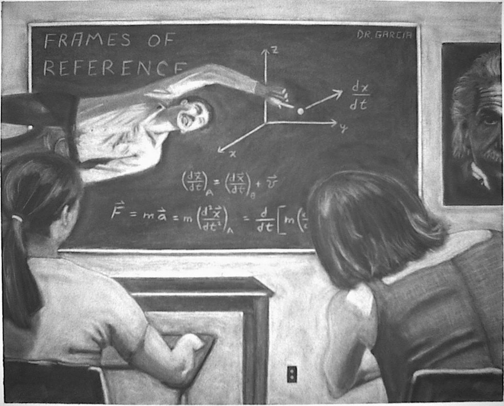

This was my final assignment in John Clapp's Introduction to Illustration. This piece is a charcoal rub-out, that is, the page is first covered completely with charcoal and then one "draws" by erasing the charcoal, same as in Jimmy Nail. Unlike "Jimmy Nail", this piece was not produced from a single photo reference, rather the composition had to be designed in stages; below I give an outline of these stages.
First, the piece was supposed to be a self-portrait but not necessarily a conventional one. We were assigned to select a single word that described our personality, my choice was "Unconventional." We then made a list of 100 or more words and phrases that complemented our word; in this list I had "orthogonal."
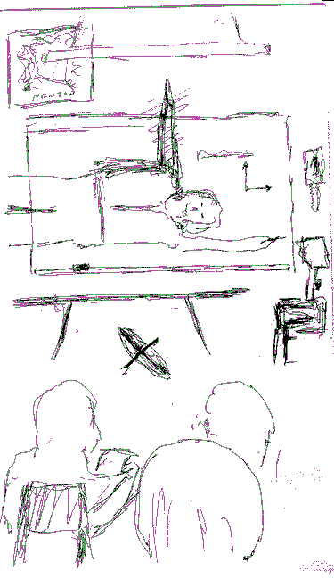
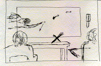
Next we used these words to stimulate ideas for scenarios. Almost immediately I chose to place myself in a classroom in a perpendicular, gravity-defying pose. This pose was inspired by the film, "Frames of Reference", that begins with two physics professors (J.N.P. Hume and D.G. Ivey, University of Toronto), one of whom is upside-down; they flip a coin to decide which one is upside-down and the surpise comes when we discover that the camera is also upside-down. To fix the specifics of the composition, I made various sketches; below are some of my early ones.
Having decided the rough composition of the piece, I shot a few rolls of film to assemble a collection of photo references. The photo collage shown below comes from pieceing together three photos from this shoot; the other seventy were discarded.
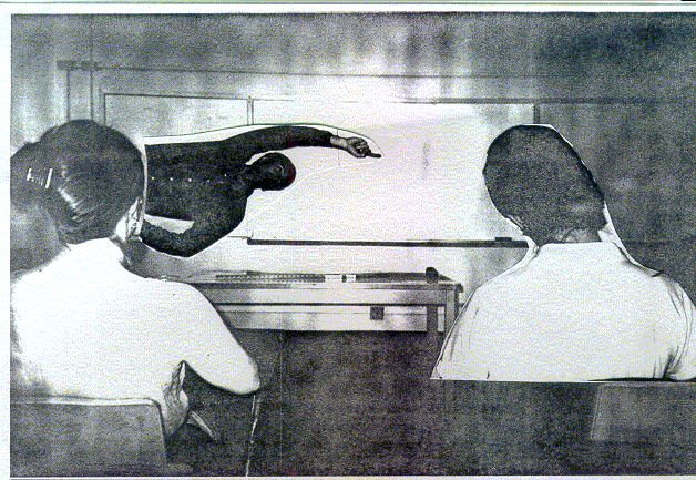
Once the main elements of the composition were decided, I shot two more rolls of photo reference in sunlight to get stronger contrasts (see below) and a few indoor shots to get the approximate perspective.
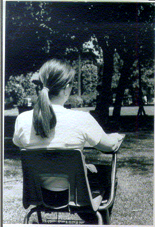
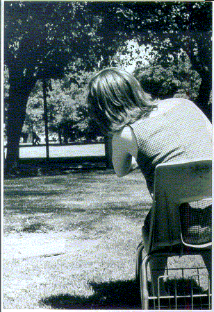
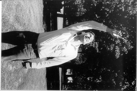
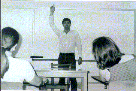
Finally, the best photos were collected and used to sketch the final draft of the composition. The initial sketch had Kathy and Jennifer further apart but I decided to cut out the middle part of the drawing (notice that it is taped together).
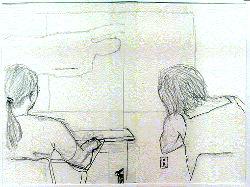
Finally, the photo references above were used when drawing the various elements of the piece. Just before finishing it I decided to add the Einstein poster to balance the left and right sides. This was a late addition but had been in the back of my mind; notice that in the very first sketch I have a poster of Newton in the upper left hand corner (above the blackboard).
Images on this page are copyrighted and not in the public domain.